Better Call Paul

Delfino Marketing Communications, Inc.
COMPANY
BASICS
PHILOSOPHY
PROCESS
WORK SAMPLES
CONTACT/MAP
SERVICES
CASE STUDIES
EXTRAS
MARKETING
INSIGHTS
Getting Ready for the "Color of the Year"
by PD | Posted Oct. 28, 2016 | color & design
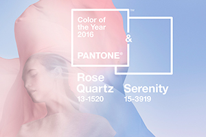 At some point during the next couple of months, Pantone will release its “Color of the Year” for 2017. As a world-renowned authority on color, Pantone’s announcement is very much anticipated in the graphic design, fashion and interior design industries. For graphic artists, Pantone has literally been the standard for color since 1963, when the Pantone Matching System was launched. Today, we pay close attention to the Color of the Year announcement because of its direct and indirect impact on what we do.
Late last year, and for the first time in its history, Pantone designated a blend of two colors, Rose Quartz and Serenity, as its 2016 Color of the Year. When talking about this unique color blend internally amongst ourselves, we found the combination of a warm color and a cool color to be particularly effective. Warm colors – most easily defined as the range from red to yellow, including browns and beiges – are often used to raise the viewer’s interest, while cool colors – typically blues, greens, violets and the like – are used to calm and relax the viewer. (Grays are another story altogether, since there are both warm and cool variations of gray.) Most people typically have a preference for one family over the other. What we noticed when looking at the new colors was that the blend of the two seemed to eliminate some of the inherent bias in each of us, which might be extrapolated to a larger audience.
Right off the bat, we looked at applications of this modified color theory in a number of different projects. For a client who needed logo designs for multiple divisions, each of which had to be different from the other but yet somehow related, the concept made perfect sense. For each logo, the color pairs could be markedly different in terms of the actual colors used, yet connected by the application of the warm/cool blend concept in each logo.
 In a trade show exhibit for a client in the fragrance industry, which often mimics the fashion world in its use of pastels, light colors, and ethereal imagery, a balance of warm and cool colors in the structural design and accompanying graphics was also very effective. It enabled us to address the color bias that is inherent in every person, while following the master design concept of the client’s other marketing initiatives to maintain continuity of message.
We are excited to see where Pantone will go with its Color of the Year for 2017. We recommend you keep an eye out for the announcement too, but remember that there are many other elements to color theory and design to inspire your creativity. This post has not touched at all on tints, shades, screens, color psychology, color harmony…and so many other important variables in color and design. If you are interested in these other elements, check out the links below.
Thanks for your time and happy marketing!
Relevant Links:


